D-tox

Yellow Flower

Problem

People who are actively trying to live healthier lifestyles often face fragmented experiences across multiple platforms for fitness, food, lifestyle shopping, and social connection. This fragmentation leads to low motivation, poor accountability, and unnecessary friction in maintaining healthy routines. Especially around planning meals after workouts and finding supportive wellness communities. As a result, users struggle to sustain consistent wellness habits, despite having the intent and interest to do so.

Solution

The Goal is to create a seamless all-in-one wellness experience that enables users to easily book wellness sessions, access healthy meals, discover lifestyle products, and connect with like-minded people, while driving increased service bookings, product purchases, and long-term community engagement for the business.

Design Process & Timeline

Design Process & Timeline

I put deliberate effort into creating the best possible user experience, and I apply this process to every project I work on.

I put deliberate effort into creating the best possible user experience, and I apply this process to every project I work on.

Overview

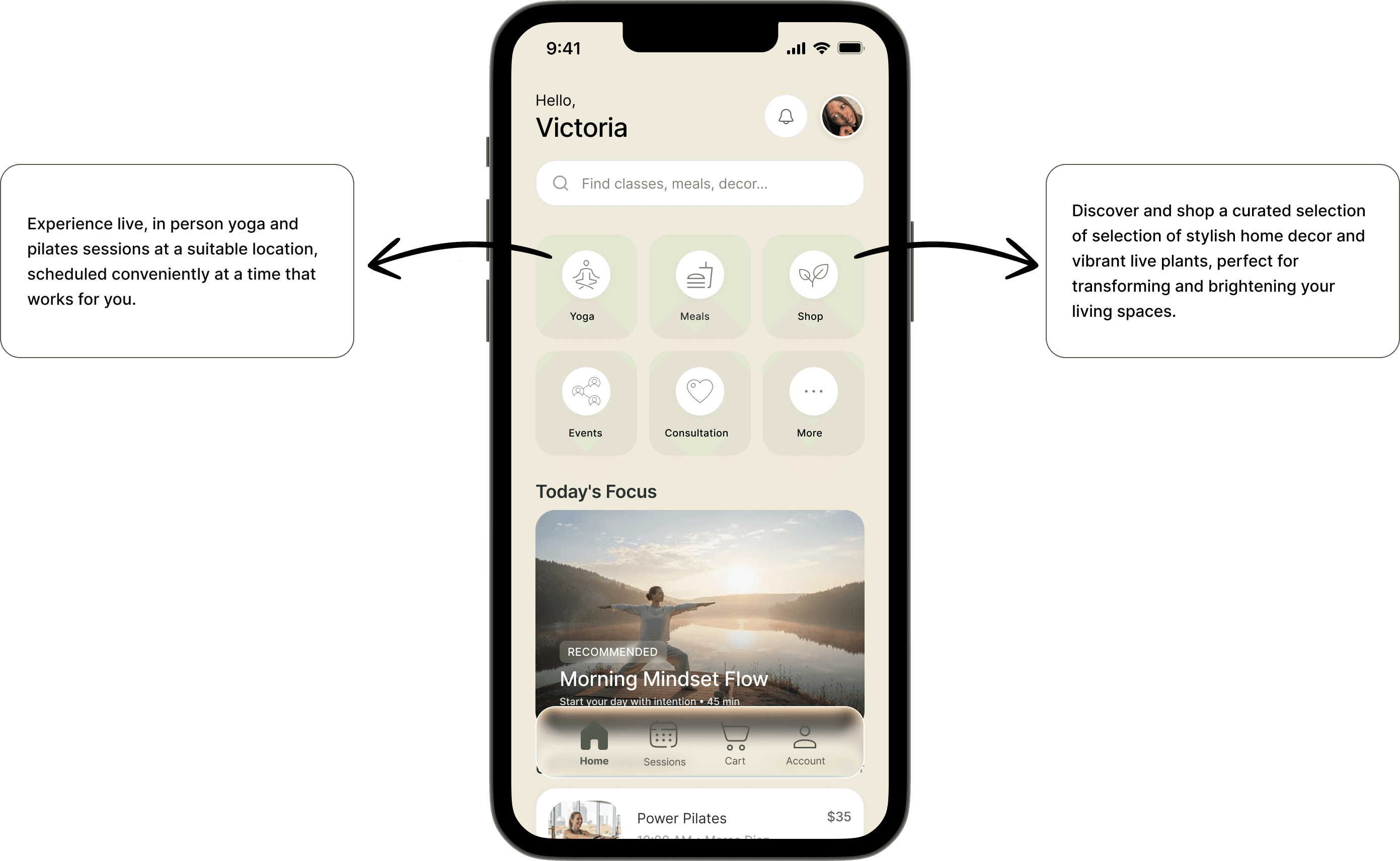
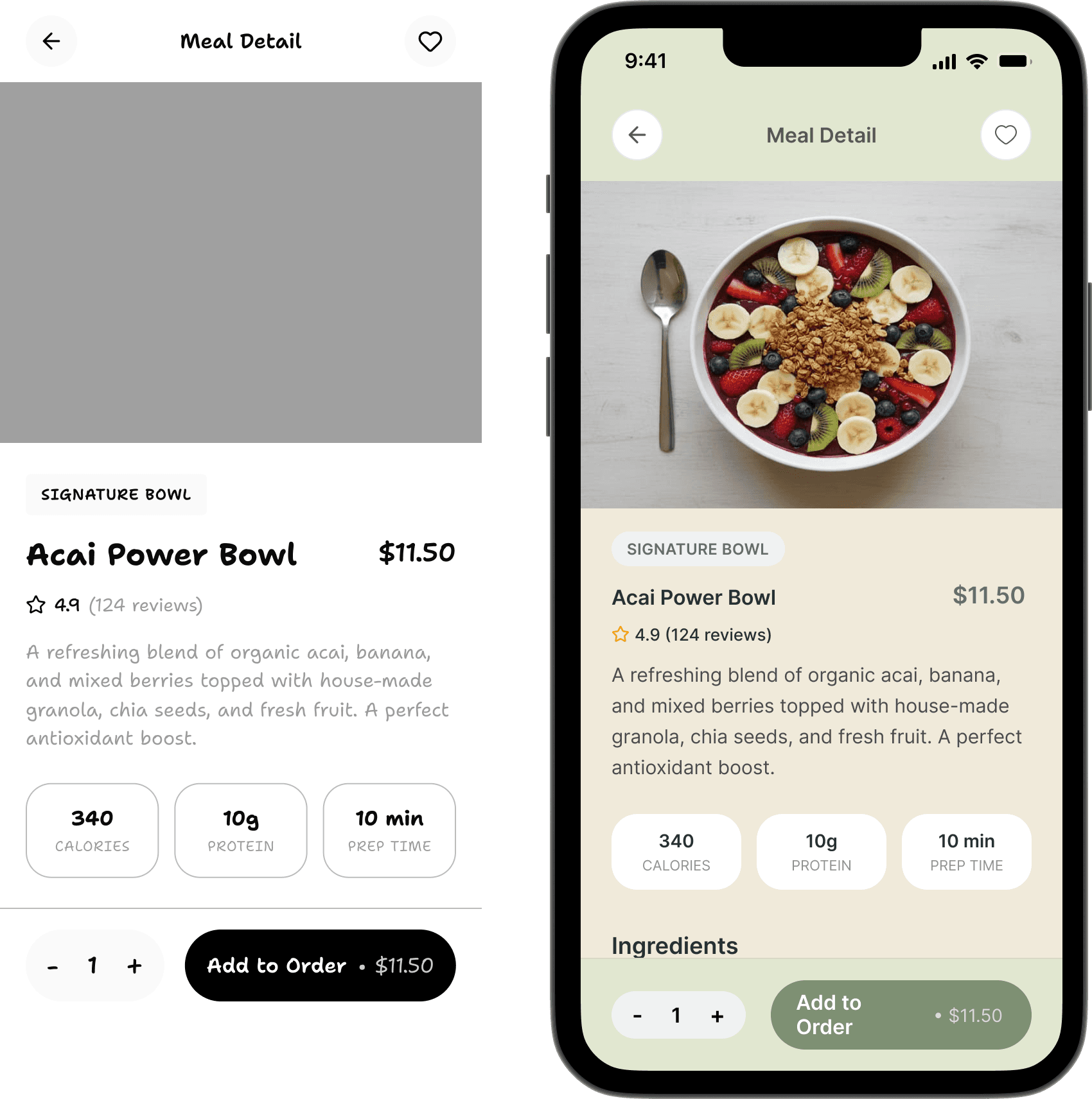
D-TOX is a holistic wellness app that enables users to book yoga and Pilates sessions, pre-order healthy meals for pickup or home delivery, shop interior decor and plants, and join wellness communities and events all within a single ecosystem designed to support physical, mental, and lifestyle wellness.


Research & Discovery

Objective: The goal of the research phase was to understand how busy urban professionals currently manage their wellness, what challenges they face, and how a digital platform like D•Tox could fit naturally into their daily routines.

Methods Used:

  • 1:1 interviews with 6 professionals (ages 23-35) living in a fast paced urban environment.

  • Short survey shared with 28 respondents to validate patterns from the interviews at a larger scale.

  • Competitive analysis of Classpass, Mindbody, Headspace/calm and Meetup
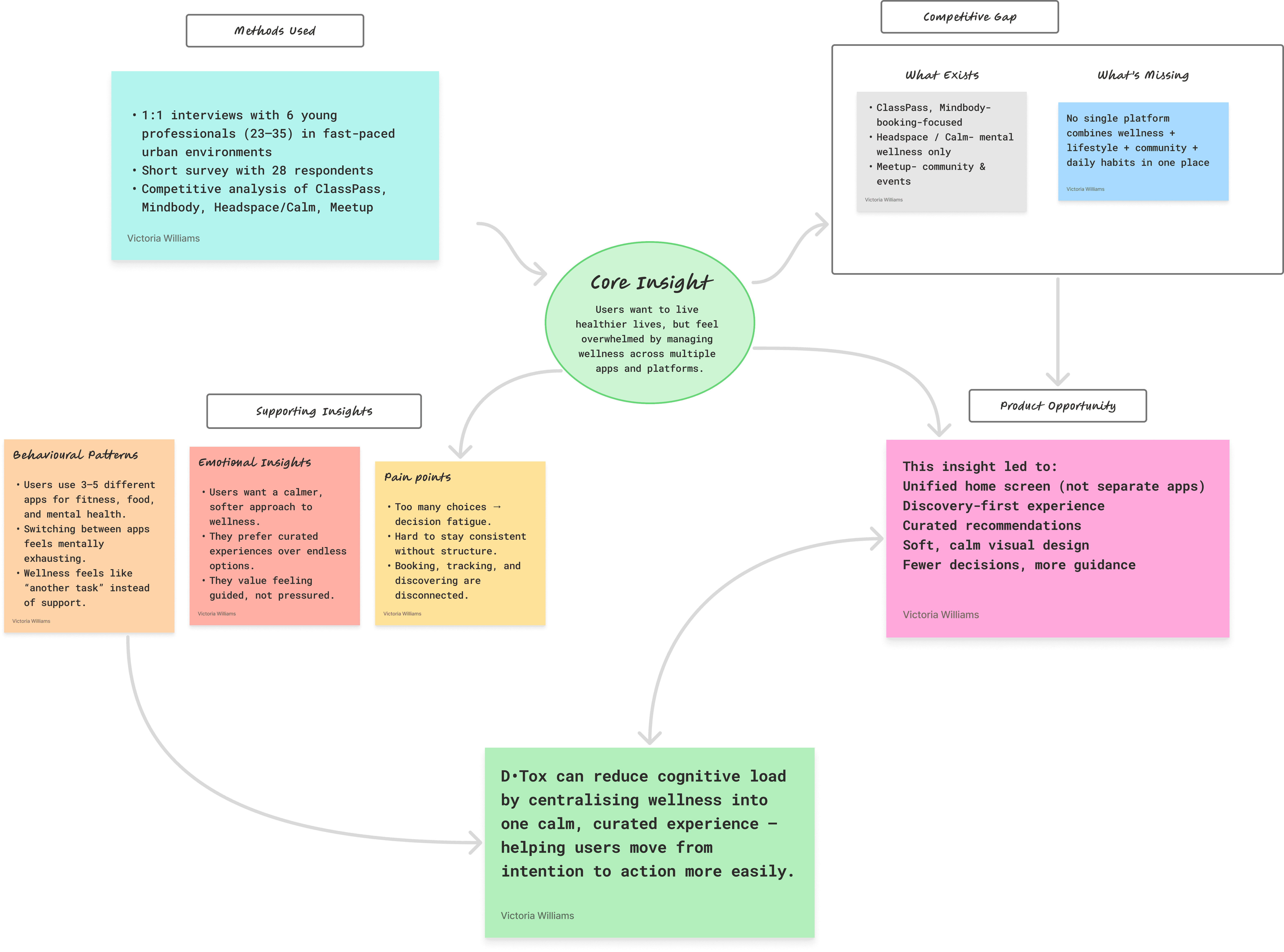


Key insights:

1. Time is the Biggest Barrier

  • Most users want wellness solutions that are convenient,

  • Flexible, and easy to book.

2. Users Want a “Soft Life” but Lack Structure

  • Participants expressed a desire for: A calmer, more intentional lifestyle

  • Better eating habits

  • Regular movement and self-care

3. Fragmented Wellness Experience: Users currently rely on

  • Multiple apps (one for fitness, another for food, another for beauty)

  • WhatsApp bookings for local services

  • Manual planning

4. Aesthetics Matter (A Lot)

  • Especially for Gen Z and young millennials:

  • Visual appeal strongly influences motivation

  • Calm, minimal, lifestyle-focused interfaces feel more inviting


Industry

Lifestyle/Wellness

Duration

10 Weeks

Year

2025

Competitive analysis

Competitive analysis

Competitive analysis

UX Approach

UX Approach

User Persona

User Persona

“As a user, I want to live a healthier, softer life, but I don’t want to spend energy planning it. I just want one beautiful app that handles it for me.”

“As a user, I want to live a healthier, softer life, but I don’t want to spend energy planning it. I just want one beautiful app that handles it for me.”

“As a user, I want to live a healthier, softer life, but I don’t want to spend energy planning it. I just want one beautiful app that handles it for me.”

User Flow

User Flow

The user flow map reflects the trip of a user from the first launch of the application to a successful booking of a session.

Gaps i saw

Gaps i saw

Opportunities for DTOX

Opportunities for DTOX

Wireframes

Wireframes

Home page wireframe

Home page wireframe

To explore the best layout for the home screen, I created two wireframe variations. Both aim to surface key content quickly, but each approaches hierarchy and structure differently.

To explore the best layout for the home screen, I created two wireframe variations. Both aim to surface key content quickly, but each approaches hierarchy and structure differently.


One key difference is that Option A uses a carousel-style slider for the main categories. However, we prefer Option B because usability studies show that users perform better when most content is visible on the screen without requiring extra swipes or interactions. Relying on carousels adds friction and increases cognitive effort.


One key difference is that Option A uses a carousel-style slider for the main categories. However, we prefer Option B because usability studies show that users perform better when most content is visible on the screen without requiring extra swipes or interactions. Relying on carousels adds friction and increases cognitive effort.


Another important distinction in the user journey is the navigation. Option B features a floating navigation menu, whereas Option A uses a more static one. We chose the floating menu because it feels more modern, adds visual flair, and improves accessibility.


Another important distinction in the user journey is the navigation. Option B features a floating navigation menu, whereas Option A uses a more static one. We chose the floating menu because it feels more modern, adds visual flair, and improves accessibility.


Overall, usability testing showed that most users preferred Option B over Option A, primarily because it feels more intuitive, easier to use, and more familiar.


Overall, usability testing showed that most users preferred Option B over Option A, primarily because it feels more intuitive, easier to use, and more familiar.

Low-fidelity wireframes

Low-fidelity wireframes

Mid-fidelity wireframes

Mid-fidelity wireframes

Final designs and deliverables

Final designs and deliverables

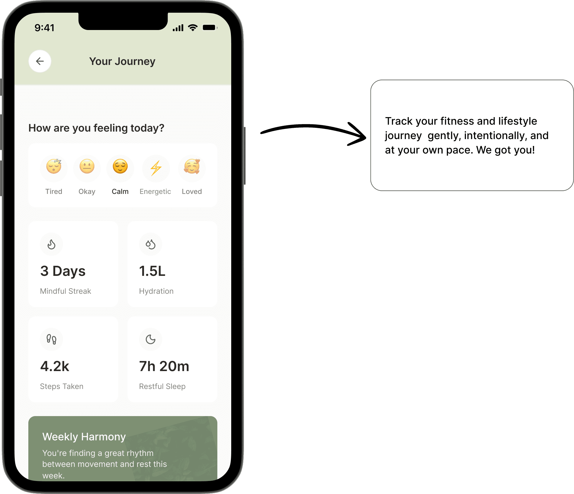
These screens bring the D•Tox experience to life by combining research-driven structure with a soft, lifestyle-focused visual language. The interface prioritises clarity, ease of navigation, and emotional comfort, ensuring users can move from intention to action with minimal friction.

Testing and Result

Testing and Result

I conducted usability testing with 6 students using a high-fidelity prototype to evaluate core flows and usability.

  • All 6 participants were able to start a focus session within 10 seconds.

  • 5 out of 6 users preferred the prototype over tools they currently use, citing clarity and speed.

  • Users reported feeling less overwhelmed due to the simplified interface and guided flow.

  • The “Focus Mode” feature was consistently identified as the most valuable and intuitive part of the experience.

More Projects

Vibescape
Vibescape
Vibescape is a mobile travel planning and booking platform that recommends destinations based on a user’s mood, preferred climate, and travel style. Instead of forcing users to search by location first, the app starts with intent whether someone wants warmth, adventure, romance, solitude, or novelty and curates destinations, stays, and experiences around that vibe. The product combines discovery, planning, booking, and memory-keeping into a single ecosystem.

Case study

Vibescape
Vibescape
Vibescape is a mobile travel planning and booking platform that recommends destinations based on a user’s mood, preferred climate, and travel style. Instead of forcing users to search by location first, the app starts with intent whether someone wants warmth, adventure, romance, solitude, or novelty and curates destinations, stays, and experiences around that vibe. The product combines discovery, planning, booking, and memory-keeping into a single ecosystem.
Work outside work
Digital daydreams
I design what I feel, when the briefs are done and the deadlines are quiet. Bold ideas, playful experiments, late-night sparks turned into pixels.These screens are proof that my love for design doesn’t clock out, it explores, it pushes, it evolves. This isn’t work. It’s instinct.

Case study

Work outside work
Digital daydreams
I design what I feel, when the briefs are done and the deadlines are quiet. Bold ideas, playful experiments, late-night sparks turned into pixels.These screens are proof that my love for design doesn’t clock out, it explores, it pushes, it evolves. This isn’t work. It’s instinct.

Create a free website with Framer, the website builder loved by startups, designers and agencies.